Subway Surfers Match – First thoughts beyond the surface level appeal
by
Intro
I recently discovered that SYBO released a new Match 3 game. I don’t get too excited about any new release of a puzzle game. But this time, the game is using the IP of the most downloaded game in the world. And it totally makes sense to be curious about what they want to offer to the puzzle segment of the casual market.
As I shared in my previous article (link here), there are specific steps that I am following to play a new game. I am going to lead by example and leverage it here!
I will try not to overload you with tiny details and go only over big things.
Discovering the game
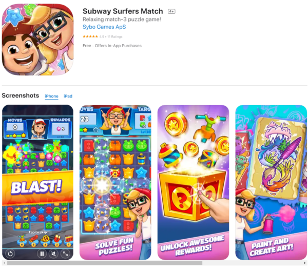
Icon
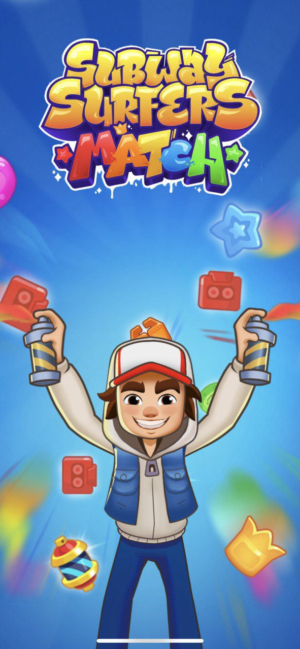
First start
Basic pieces
I would say that basic pieces are solid. Very distinguishable, with different shapes and colors.
It’s very comfortable to search for matches.
The only friction point here was the number of sharp details. Usually, those details alleviate the overall noise inside the game. And it’s pretty critical when you think about the future art ecosystem with many different late-game obstacles.
Art-wise, the basic pieces are not too exciting. I didn’t experience any wow moments with the picture built on the game board. Maybe that’s the overall approach, but I would like to see something more interesting in the game where I want to push through thousands of levels and spend multiple hours.
Power-up system
That’s where I felt the first bit of a real disappointment because this system copies Matchington Mansion’s approach to power-ups with all its flaws.
I do believe, in the current market where you have three excellent options, such as “Candy Crush Saga,” “Royal Match,” and “Gardenscapes,” developers should be either innovating or copying one of the most successful power-up systems. In my opinion, it’s very unlikely that if you just copy a mediocre power-up system, you’ll be able to reach great success.
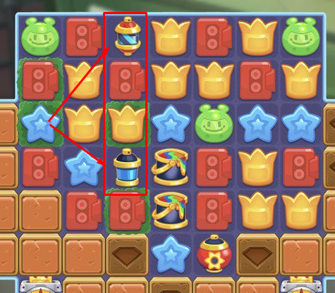 Art-wise the readability of the power-ups is lagging too:
- Tiny cross and line power-ups are pretty similar, and the player needs to pay attention to what is what. Even after many levels, three days later, I was still paying attention to not mixing them.
- Too much yellow is presented on power-ups, blending with basic yellow pieces.
The overall feeling for the power-up system was not great, despite the fact that this part of the game is one of the most impactful areas for the experience.
On the bright side, I should mention the adoption of the one-tap activation for power-ups. Good, trendy feature!
Game obstacles
The game starts with a typical list of power-up tutorials. It is fine. We always want to be clear and easy to understand at the beginning of the game.
Let’s list obstacles introduced in the early game to understand their evolution:
- Level 2: Boxes. “Match near” interaction
- Level 10. Grass. “Match on”
- Level 15. Bottles 2×2. “Match near”
- Level 20. Ticket generator. Indestructible “match near”
- Level 30. Bottle caps. Falling “match near” element
- Level 40. Colored bottles 2×2. Colored 2×2 “match near”
- Level 50. Caps. “Match near,” which is falling
- Level 60. Sandwich. Another falling “match near” element
The pace of new obstacles introduction is admirable. Not too fast, not too slow. It’s just right, and I liked it.
But the obstacle list is not succeeding in building a diverse mechanical system here. As you can see, almost everything revolves around match-near interaction. Even though variability in size and gravity add some flavor, it is still a very repetitive match near obstacle destruction for almost 60 levels straight.
Innovation
As far as the early experience goes, I didn’t notice any significant innovation in the core gameplay.
Skipping on innovation is a risky business bet and looks disappointing for me as a player and designer.
Mid-cascading matches
You cannot make any moves during mid-cascading in Subway Surfers Match. It’s not like I was going to make tons of crazy tricky moves while the pieces are falling, but I simply didn’t want to wait for long cascades to finish. In my opinion, in 2022, mid-match cascading should just become the staple of the match-3 genre, and that’s that. The funny thing is that it’s not even too hard to implement. Still, so many games ignore this critically important quality-of-life feature for some reason.
Level design
After playing around 100 levels, I would say that level design is solid. There are no significant flaws or drawbacks. Maybe it’s too similar to Matchington Mansion. You can easily recognize some similar patterns. Like putting grouped by colors pieces, for example.
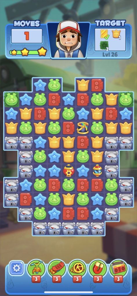
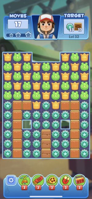
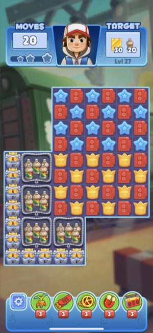
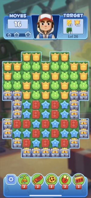
I had a feeling that Royal Match was also partially a source of inspiration, but mainly because of the specific board setup when you have a 9×11 vertical board. Also, there are some minor mistakes here and there. For example, on the first screenshot (level 26), if you will ruin the starting combo “green match 5” + “yellow bomb,” you will lose with a high probability.
Difficulty
The game starts with the typical welcoming difficulty curve. Still, level 24 hits you with a suspicious paywall-like difficulty. And then repeats this trick more or less every ten levels. This approach was barely acceptable five years ago, but I am not sure if players are happy with that these days. My guess is people are churning at level 24 like it’s 2012.
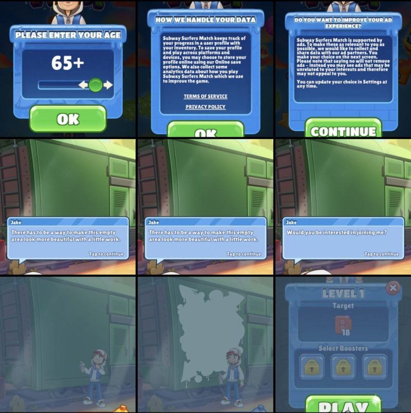
“Meta” part
The “Meta” part of the game is heavily inspired by “Royal Match” but subjectively does not deliver the same interest. Nothing is happening, and you are just painting some parts of graffiti. I would be much happier discovering iconic visuals of the original IP.
Overall feeling
The game looks, plays, and feels fine, but I had pretty high hopes for it, and the game did not deliver across three important categories:
- Innovation in the core gameplay. Power-up system and obstacles especially.
- Choice of the power-up system that is not original or competitive compared to S-tier games in the genre
- Absence of mid-match cascading.
But I definitely should mention some good stuff that I enjoyed:
- The game is quite fast, even if it cannot hide the absence of mid-match cascading
- The pieces are great from the logic side and super-readable.
- The level design is solid.
As a player, I appreciated the attempt to introduce the star system. Still, it does not make much sense when you cannot replay the level and improve your score. But still, it’s a decent addition to the primary reward.
I will refrain from commenting on the audience fit and other product-oriented stuff. The goal of this deconstruction is to concentrate on the game design side.
Takeaways
This article is a subjective deconstruction where I mostly applied the rules and definitions shared in the previous article (link again).
You can follow it step by step and build your vision on how to approach a new game and understand what kind of chances it has against the current market and its strong and weak points.
I almost forgot to add my summary about the game. Even though I like the game, it can’t compete on the highest level with puzzle mastodonts without serious innovation inside the core gameplay.
Thanks for reading, and see you soon!